Logos
Logos, branding and app icons, from a full company rebrand to stickers.
SuperAwesome
SuperAwesome builds the technology, and brings together the people, that power the kids’ digital ecosystem worldwide. It’s a bold, ambitious company and a leader in its field, and its name says so. I pitched a rebrand to the CEO so that our design would match those values and strengthen our position in the market.
A rebrand was a chance to sharpen the company’s mission and bring our products into line, which would make the design teams more efficient. Waiting would only make it more expensive. It would also help us show our values, explain our products to clients and attract new hires.
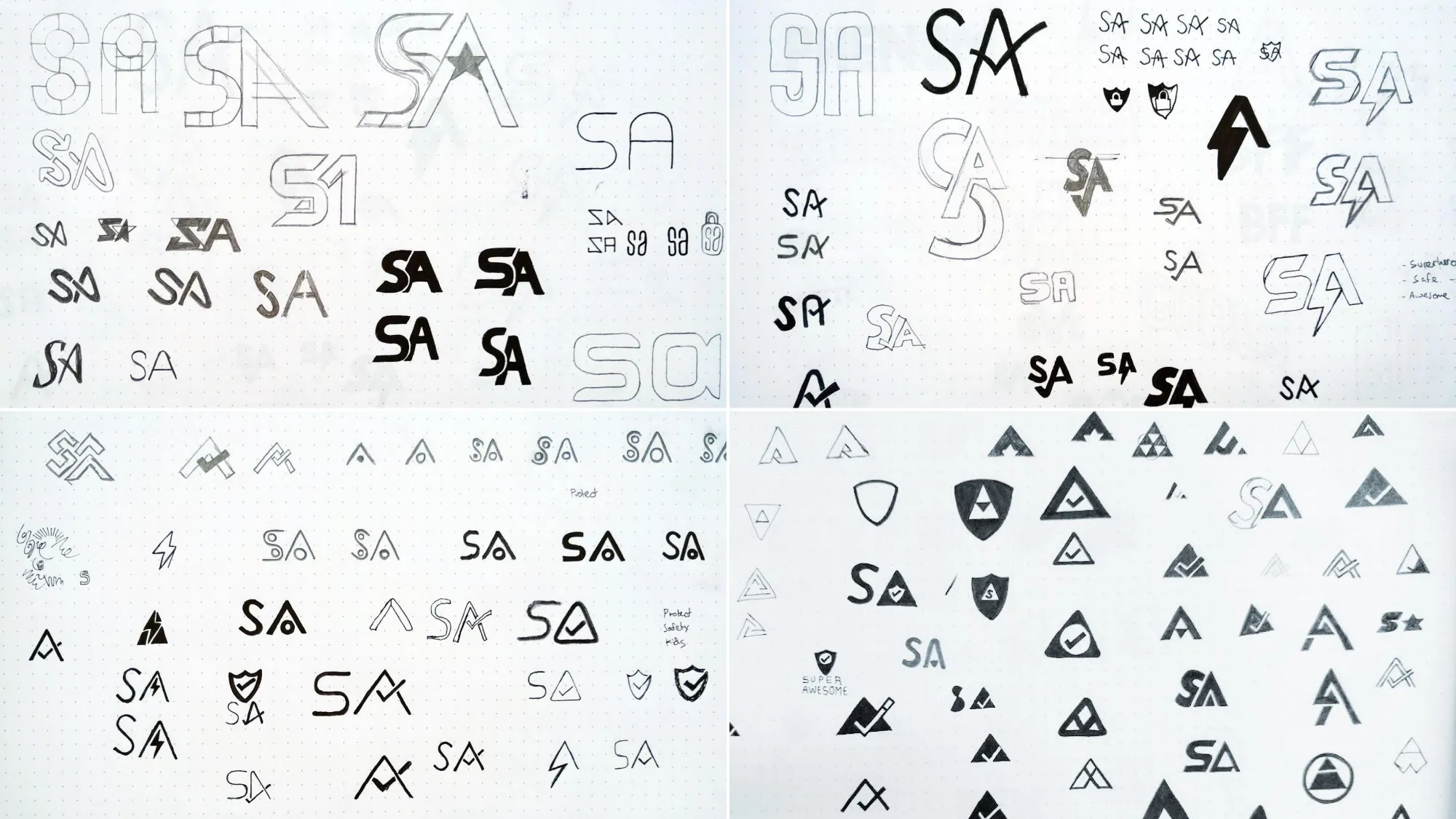


Alongside the brand, I redesigned SuperAwesome’s product suite and helped design the new website.

The PopJam app icon
PopJam’s original icon suited the app at launch, but the app outgrew it. The icon didn’t grab attention or say what the app was for. Its lightning bolt represented the feed, which was no longer the heart of the app. Some people called it vaguely militaristic, and it could read as masculine, which risked putting off girls and younger kids.
I explored hundreds of variations across many directions, reviewed them with the team, then ran quantitative and qualitative tests with users.


More logos
I designed the branding for JellyChat, the app that became PopJam, and PopJam’s earlier branding before we pivoted to an older audience.


At Mind Candy I designed the app icon and logo for World of Warriors Duel and the logo for Moshi Fishing, and worked with another designer on The 7 Second Challenge.


I also designed logos and websites for Kotori Research, my wife’s company, and Divergent, a former colleague’s youth-market insight and strategy consultancy.


Stickers
I designed all sorts of stickers for PopJam: reactions and slang like OMG, Yaas, LOL and BFF, each in its own lettering style.

